

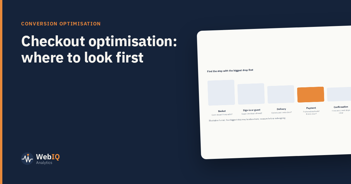
Checkout is where intent turns into revenue, and where small problems are most expensive. It's also where teams most often jump to redesigns without knowing what's wrong. Start by finding the biggest drop, then understand it.
Measure each step
Track every step as an event: basket, sign-in or guest, delivery, payment, confirmation. Calculate the share of people who continue at each one, by device. The step with the biggest drop on your highest-traffic device is usually where to start.
Common problems by step
- Basket: unexpected delivery costs, hard-to-edit quantities, promo code fields that send people looking for discounts.
- Sign-in: forced account creation. Offering guest checkout is one of the most common fixes.
- Delivery: unclear options, costs or dates; long address forms without lookup.
- Payment: missing preferred payment methods, unclear errors, card forms that don't work well on mobile.
- Confirmation: the purchase event firing twice, or not at all, which corrupts measurement of everything above.
Understand why
Use exit surveys on checkout pages, session recordings filtered to people who left, and customer service logs. Look for patterns rather than single stories.
Fix the obvious, test the uncertain
- Clear bugs and errors: fix them straight away; don't test whether broken things should be fixed.
- Changes with real uncertainty (layout, step order, payment options): test them, sized properly.
Watch the right metrics
The primary metric is completed orders per visitor reaching checkout. Guardrails include average order value, payment failures and returns. A change that lifts completion but increases failed payments isn't a win.
Keep checking after changes
Checkout changes often interact with payment providers, fraud checks and tracking. Monitor completion, payment errors and purchase events for a few weeks after any release.